
# PMS Colors for Custom Packaging: How to Specify, Proof and Approve Brand Color
Every packaging quotation contains one field where a guess costs a rerun: the color line. “Match our brand teal” is not a specification; a PMS code is. This guide covers what PMS colors are, how they differ from the CMYK printing beside them, why the same code shifts between materials, and the proof-and-approval workflow that turns a color choice into a production standard — including how our own factory controls color on press.
Key takeaways
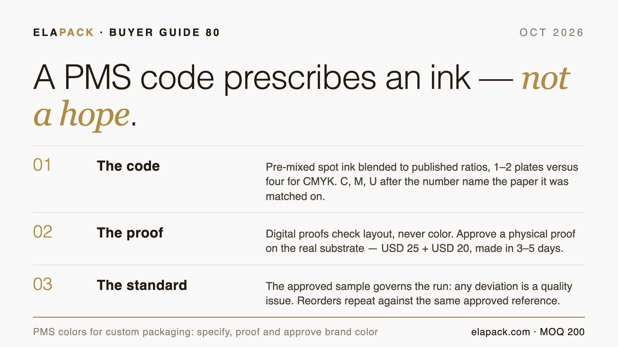
A PMS color is a numbered, pre-mixed ink; specifying it by code, then approving a physical proof on the real material, is what makes brand color repeatable across runs.
- PMS codes identify pre-mixed spot inks blended to published ratios — roughly 1 to 2 plates per color versus four for CMYK.
- The suffix matters: C, M and U after a Pantone number mean coated, matte and uncoated paper, and the same code shifts between them.
- Digital proofs check layout, not color; approving color from a screen is the most common and most expensive mistake in custom packaging.
- An approved physical sample becomes the reference standard for the run; deviation from it is a quality issue, not a preference.
Last updated October 2026.
What is a PMS color?
PMS stands for Pantone Matching System — a standardized color-matching system developed by the Pantone Corporation in the 1960s and used globally across printing trades. Each color in the system carries a universal reference code, and the Pantone handbook “provides precise ratios for blending base colors to produce each specific PMS shade”, as Boxlark’s packaging guide puts it. That is the whole idea: the code does not describe a color so much as prescribe an ink. Printer A and printer B mixing the same code should arrive at the same physical color, which is why a brand’s packaging matches its stationery and its swing tags without anyone mailing samples back and forth forever.
For packaging buyers, the practical consequence: when your artwork specifies a PMS code, you are specifying an ink that exists before printing starts. When it specifies “teal, see logo”, you are specifying a hope.
Spot color versus CMYK: two ways to put color on a box
Most custom packaging uses both systems, for different jobs. CMYK process printing builds every color from four transparent inks — cyan, magenta, yellow, black — which makes it the economical default for photographic and full-coverage art. PMS spot color uses pre-mixed inks run on their own plates; Boxlark’s comparison notes a spot color “needs only 1 to 2 plates per color compared to the CMYK color model” and that “pre-mixed colors offer superior consistency and precision in printing”.
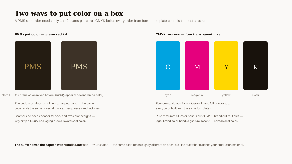
The rule of thumb that falls out of this: full-color photographic panels print CMYK; brand-critical fields — the logo, the brand-color band, the signature accent — print as spot color. A one-color or two-color design run entirely in PMS inks is usually sharper and often cheaper than the same design faked in four-color process, which is why simple luxury packaging skews toward spot color.
One limit to plan around, published by Pack Your Brand: “some colors, especially neon, metallic, and certain deep blues, cannot be perfectly reproduced even with spot inks”. If the brand palette lives at those edges, the conversation with the factory happens before the dieline, not after the first delivery. The CMYK side of that comparison — how process colour behaves on packaging, which colours sit outside its gamut, and how colour is approved on a sample — is covered in our CMYK printing guide.
Why does the same PMS code look different on different materials?
The code prescribes the ink, not the light around it. “Pantone colors can also shift depending on the substrate”, Pack Your Brand’s workflow guide notes — “the same PMS code will look slightly different on coated paper, uncoated kraft, or fabric.” The suffix system exists precisely for this: the solid palette “uses the suffixes C for coated, M for matte, and U for uncoated paper”, so a code chosen from the coated fan deck is the code that will read true on a coated box wrap.
For custom packaging this matters twice. Across materials: a brand color specified from a coated swatch book will not land the same way on an uncoated kraft mailer or a satin pouch. Across finishes: lamination itself moves the printed color — Mixam’s color-variance guidance is specific that “like paper, lamination can affect your final colors”: “matte lamination reduces shine. Matte lamination, moreover, can desaturate colors slightly and even apply a slight colored tint”, while “a gloss laminate can enhance color saturation and provide an extra shiny coating”. Paper compounds it in the same direction — satin is the paper that reproduces color most accurately, “gloss tends to increase hue saturation”, and “uncoated or recycled paper darkens and desaturates the final color”. The fix is not a better guess — it is naming the actual production material in the specification, and approving color on that material.
How do you specify PMS colors when ordering custom packaging?
The workflow that works, published end-to-end by Pack Your Brand, has four moves:
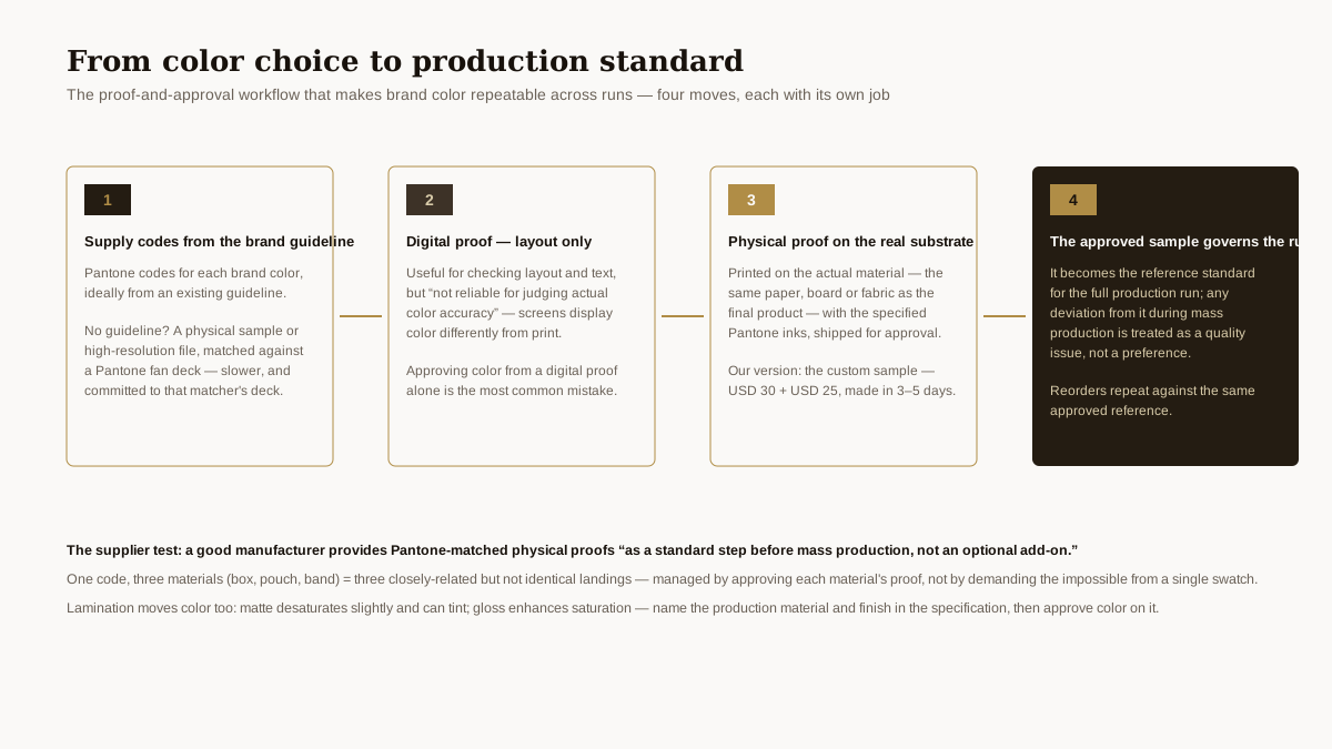
- Supply codes from the brand guideline. “The buyer provides Pantone codes for each brand color, ideally from an existing brand guideline.” No guideline yet? The fallback is a physical sample or a high-resolution digital file, which “the manufacturer can match…against a Pantone fan deck” — slower, and it commits the match to that manufacturer’s fan deck.
- Check layout on the digital proof — and nothing else. A screen mockup is “useful for checking layout and text but is not reliable for judging actual color accuracy”, because “screens display color differently from print”. Treat the PDF as a layout artifact.
- Approve a physical proof on the real substrate. The factory “prints a physical sample on the actual substrate (the same paper, board, or fabric as the final product)…using the specified Pantone inks, and ships it to the buyer for approval”. Our version of this step is the custom sample — USD 30 plus USD 25 shipping, produced in 3–5 days on the ordered material.
- Let the approved sample govern the run. “Once the buyer approves the physical sample, that sample becomes the reference standard for the full production run”, and “any deviation from it during mass production is treated as a quality issue”. That single sentence is what separates a color specification from a color suggestion.
Pack Your Brand’s closing test for choosing a supplier is worth quoting directly: a good manufacturer “should be able to provide Pantone-matched physical proofs as a standard step before mass production, not an optional add-on”.
How we control color on the production run
Color control on our floor follows a documented four-step color-control routine on Heidelberg press equipment, and our quotations carry an explicit color-deviation notice — a standing acknowledgment that printing is a physical process, stated up front rather than discovered at delivery. In practice the buyer-facing sequence is the one above: codes or samples in, physical proof on the ordered material out, approval, production to the approved reference. The color line sits in the specification sheet alongside dimensions and materials — our guide to reading a packaging specification sheet covers that document field by field — and reorders repeat against the same approved reference rather than a new interpretation.
For brands running the same product across box, pouch and band, the honest expectation to set internally: one code, three materials, three closely-related but not identical landings — managed by approving each material’s proof, not by demanding the impossible from a single swatch.
Sources
- Pack Your Brand — Pantone Color Matching for Custom Packaging: How Proofing and Approval Works — https://packyourbrand.com/pantone-color-matching-for-custom-packaging-how-proofing-and-approval-works
- Boxlark — What is PMS? The Secret to Consistent Packaging Colors — https://boxlark.com/what-is-pms
- Mixam — Color Variance — https://mixam.com/support/colourvariance
Frequently asked questions
What is a PMS color?
A color identified by a numbered code in the Pantone Matching System, printed from a pre-mixed ink blended to published ratios. Because the code prescribes the ink rather than describing an appearance, the same PMS code produces the same physical color across presses and factories.
What does the C or U after a Pantone number mean?
The paper it was matched on: C for coated, M for matte and U for uncoated, per the solid-palette suffix system. The same code reads slightly different on each — pick the suffix that matches your actual production material.
Should I approve packaging color from a digital proof?
No — “approving a color from a digital proof alone is the most common mistake”, because screens display color differently from print. Use the digital proof for layout and text; approve color only on a physical proof printed on the production material.
Can every color be matched in Pantone ink?
Most can, but “some colors, especially neon, metallic, and certain deep blues, cannot be perfectly reproduced even with spot inks”. If the brand palette sits at those edges, align expectations with the factory before tooling.
How do I convert my CMYK or RGB artwork to Pantone?
Treat any converter output as a starting point, not an answer: the reliable path is a physical sample or high-resolution file matched against a Pantone fan deck, then a physical proof on your production material for final approval.
---
We print to approved color references — specify by PMS code, proof on your production material with a USD 25 custom sample, and the run is governed by the sample you approved. [Send your brand colors for a quotation](https://elapack.com/contact/).