
CMYK is a colour system, not a quality grade. This guide explains how process printing behaves on packaging materials, which colours it cannot reach, and what to confirm on a physical sample before approving production.
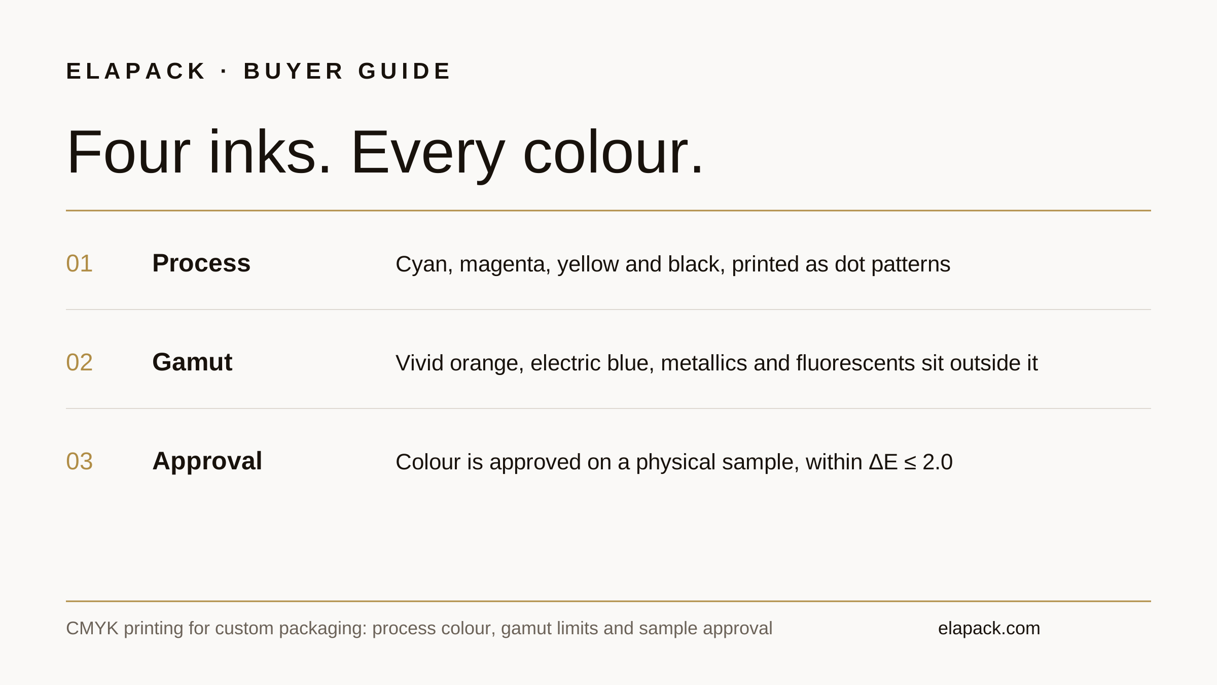
Quick answer: CMYK builds every colour from four process inks — cyan, magenta, yellow and black — printed as dot patterns. It is the right system for photographs, gradients and full-colour artwork on packaging. It cannot reproduce every brand colour: vivid oranges, electric blues, metallics and fluorescents sit outside its gamut, and the same CMYK values shift with the paper, wrap and finish. Specify critical brand colours as Pantone spot colours, and judge all colour on a physical sample of the final construction.
Key takeaways
- CMYK is four inks, not a colour library: every shade is a percentage mix of cyan, magenta, yellow and black, so results depend on the press, the stock and the finish.
- Some colours have no CMYK equivalent — saturated oranges and blues lose vibrancy, and metallic and fluorescent colours cannot be built from process inks at all.
- The same CMYK values print differently on coated and uncoated papers, on textured wraps and under matte or gloss lamination; approve colour on the final construction, not on a screen or a plain paper proof.
- Keep photographs and multi-colour artwork in CMYK; move a small number of brand-critical colours to Pantone spot colour and specify them with the full code, including the C or U suffix.
- Colour acceptance at ELAPACK is checked against the approved sample with a tolerance of ΔE ≤ 2.0; bulk production starts only after the sample is confirmed by email.
What does CMYK mean in packaging printing?
CMYK stands for the four process inks: cyan, magenta, yellow and black (K). A colour image or design is separated into these four inks, and each is printed as a pattern of small dots at its own screen angle. The dots overlap in different percentages, and the eye reads the mixture as the intended colour. Pantone's technical reference describes process colour this way: varying the percentages of the four inks offers thousands of colour possibilities, which is why CMYK is the standard system for full-colour printing.
On packaging, that means a photograph of a product, a gradient background or a multi-colour illustration is printed in CMYK. The artwork file carries the CMYK values; there is no single "brand ink" being mixed. This is also why CMYK printing scales well across a set: the box, the tissue and the card can all be printed from the same four-ink system, and consistency is then controlled by the approved sample and the colour tolerance, not by an ink formula.
The alternative is spot colour: one pre-mixed ink per colour, printed as a solid. The Pantone Matching System (PMS) is the standard spot-colour library, and our PMS colour guide covers how to specify, proof and approve a spot colour when ordering. The two systems are often combined on one box — CMYK for the imagery, a spot colour for the logo.
Which colours can CMYK not reproduce?
Process inks have a smaller colour gamut than the full Pantone library. Pantone notes that some spot colours are cleaner and brighter than anything the four-colour process can build, because spot inks are mixed from a wider range of base pigments. In practice, buyers meet the limit in four places:
- Vivid oranges, reds and greens — the CMYK simulation is visibly duller than the spot original.
- Electric and deep blues — a common brand-colour family where the process version shifts towards purple or grey.
- Metallic colours — gold and silver effects cannot be mixed from CMYK inks; on packaging they are produced by foil stamping or a metallic substrate instead, which is a different process with its own sample check.
- Fluorescent colours — no CMYK equivalent exists.
Pantone's Color Bridge guides exist for exactly this decision: each Pantone colour is shown next to its closest CMYK simulation, so the loss is visible before anything is printed. If a brand colour sits outside the gamut, converting it to CMYK values does not solve the problem — it only hides it until the sample arrives. Print that colour as a spot colour, or accept the simulation knowingly after seeing it on a physical sample.

Why can the same CMYK values print differently on different packaging?
Because the ink is only one of three variables. The second is the substrate: Pantone prints its own references on coated (C) and uncoated (U) stock because the same colour reads differently on each — uncoated and textured papers absorb more ink and mute the result, while a smooth coated wrap keeps it closer to the reference. Packaging adds more surfaces than a paper swatch: art paper, textured wrap, faux leather and kraft all take ink differently, and a colour approved on flat paper can shift again on the wrapped board.
Kraft deserves a specific warning. CMYK inks are translucent, so on natural brown kraft the board itself works as a dark filter under every colour, and the standard four-ink set contains no white ink to block the brown base. Vivid artwork designed on a white screen therefore prints visibly duller and darker on kraft. If a design needs bright colour over a kraft look, raise it when you brief the order rather than after the sample: the construction has to be settled first — for example spot colours, an underbase, or a white board printed with a kraft pattern — and which of these fits is confirmed in the quotation, not assumed.
The third variable is the finish applied after printing. Matte lamination softens contrast and deepens dark colours; gloss lamination raises saturation; soft-touch films change both. This is why a digital proof or a print on office paper can only approve layout and content, never final colour. Colour is approved on a sample made with the actual board, wrap and finish of the order, reviewed in consistent light — the same review discipline described in our colour tolerance guide.
When should a brand colour be printed as a Pantone spot colour instead?
Use spot colour when the colour itself is the brand asset and it must stay identical across components and repeat orders: a logo colour, a signature brand shade, or a colour that a set's box, bag and card must all match. Spot ink is mixed to a formula, so the reference does not depend on a four-ink balance holding steady.
Stay with CMYK when the artwork is photographic or multi-colour, when gradients and shading carry the design, or when the colours are decorative rather than identity-critical. Many projects use both: CMYK imagery with one spot colour for the logo, plus foil or embossing where a metallic or tactile effect is wanted. If you are converting an existing Pantone reference to CMYK for a photographic design, check the Color Bridge simulation first and name the full Pantone code — including whether your reference is the coated or uncoated version — when you brief the order. The PMS colour guide sets out the specifying workflow in full.
What artwork should buyers supply for CMYK printing?
- Files in CMYK mode, not RGB. Screens display RGB; a file left in RGB is converted before printing, and saturated screen colours are usually the ones that move.
- Logos and text as vector artwork, placed on the dieline so position and bleed are unambiguous.
- Images at production resolution — 300 dpi at the printed size is the working standard; a web image enlarged across a box face will soften.
- Black handled deliberately. Fine text is usually printed in 100% black alone so the letters stay sharp; large black areas are often built as a rich black (a CMYK mixture) so they print deep rather than washed out. Confirm which treatment your artwork uses rather than leaving it to default conversion.
- Every colour reference named. For each brand colour, state the Pantone code (with C or U suffix) or the CMYK values you intend — not both interchangeably, because they are different instructions.
What should buyers check on the printed sample?
The sample is where CMYK decisions become visible. Check the brand colours against your reference under consistent light, check gradients for banding, check small text for sharpness, and check the colour on the finished construction — wrapped, laminated and assembled — not on a flat sheet. At ELAPACK, colour is accepted against the approved reference within ΔE ≤ 2.0, and bulk production proceeds only after you confirm the sample by email; finished-sample photos or video can be sent before dispatch on request. A custom sample costs USD 30 plus USD 25 shipping and takes 3–5 days to make; the fee is deductible against the confirmed first order. The sample guide walks through the full approval sequence.
If a colour misses on the sample, name the component and the reference it should match — "the lid blue against Pantone 286 C" is actionable, while "the colour looks off" is not. A second sample round on one corrected variable is cheaper than a production run approved on a hope.
Questions buyers ask
Is CMYK printing lower quality than Pantone?
No. They are different systems for different jobs. CMYK is the only practical way to print photographs and full-colour artwork; Pantone spot colour is more exact for a single brand colour. Premium packaging routinely combines both on the same box.
Can a Pantone colour be converted to CMYK values?
It can be simulated, and Pantone's Color Bridge shows the closest CMYK equivalent for each colour. For colours inside the CMYK gamut the simulation is close; for vivid, metallic or fluorescent colours there is no true equivalent, and the difference is visible on the sample.
Why does the print look different from my screen?
Screens emit light in RGB and can display colours outside the CMYK gamut; print reflects light from four inks on a specific material. Judge print colour from a physical sample of the final construction, in consistent light, against the named reference.
Does choosing CMYK or a Pantone spot colour change the minimum order?
No. The minimum is 200 pieces per product or component whichever system the artwork uses. If a design combines several spot colours, the setup for that design is confirmed in the quotation.
Sources
- Pantone — Spot vs. Process Color — Pantone's technical reference on spot and process colour, CMYK separation, coated and uncoated references, and the Color Bridge simulation guides.
- ELAPACK confirmed terms — ΔE ≤ 2.0 colour tolerance against the approved sample, sample fees and approval-by-email workflow as stated in this guide.